Decorative School Projects: There’s a specific kind of project that stops people mid-leap for decorative school projects for exhibitions at a school. It isn’t always the most technically complex one, but the one that looks intentional, where the colours, layout, textures, and the presentation work together to pull the viewer in before they’ve read a single label. That quality will only separate decorative school projects from displays that can convey true information.
Decoration here doesn’t only mean glitter and stickers. It means every visual material, colour, proportion, and arrangement will serve the concept being presented. This distinction only matters during a viva, where a teacher will ask why you made the choices you have decided on. If you can answer that question with confidence, the aesthetic effort becomes academic evidence.
Here’s how to approach these decorative school projects for exhibitions across different formats, with specific ideas that will work for exhibitions, competitions, and viva evaluations.
Also check this out: PPT Design for Students Using PowerPoint & Canva
Decorative School Projects Ideas
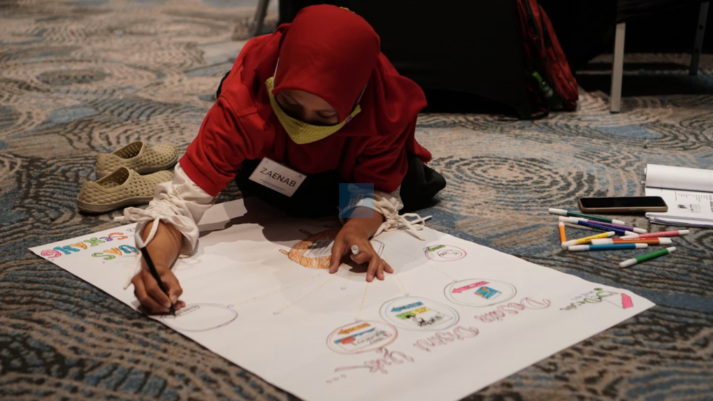
Display boards that communicate before anyone reads them
A flat display board is the most common thing in school exhibitions, and it all looks similar: printed text, clipart borders, a title in bubble letters. To earn attention, we have to do something different.
Layered texture boards
For a soil erosion project, we can build the display board in physical layers rather than flat sections. Glue actual sand to one portion, dried leaves, and you can leave a blank section or a burnt edge section, which represents nature. Use fabric or moss podge to show a healthy forest vibe. The three-dimensional contrast communicates the message visually before the viewer processes any written content, which is exactly what you want in a crowded exhibition hall.
Monochrome palettes with one accent colour
For decorative school projects for exhibitions, students often use too many colours, which makes boards visually noisy. Try building your entire board in one neutral palette kraft brown, ivory, or grey and use a single bold accent colour only for the most critical data points or headings. This technique, borrowed from graphic design, forces the viewer’s eye to land exactly where you need it. It also photographs well for competition submissions and looks polished rather than childish.
Working models with decorative presentation frames
A working model gains significantly when it’s framed and contextualised decoratively. The model itself may be functional, but the base, backdrop, and labelling style determine whether it reads as a rushed school submission or a genuine project.
Habitat dioramas with thematic borders
For biology or environmental science, build a cross-section of habitat: forest floor, coral reef, desert ecosystem inside a deep cardboard box. Line the inner walls with painted backdrops that gradually shift from foreground detail to atmospheric distance, the way a theatre stage uses depth. Use natural materials like sand, bark, dried grass, and small stones for the floor layer. Frame the box opening with a border made from relevant materials: twigs for a forest habitat, rope and shells for a marine one. The frame signals what the viewer is about to see and creates a moment of visual preparation before the content registers.
Circuit or physics models on themed bases
A working circuit model on a plain wooden board looks like every other circuit model. The same model mounted on a base painted to resemble a city grid with matchstick buildings, tiny road markings, and LED lights wired through the “buildings” becomes a project about electrification in urban planning. The decorative framing adds interpretive context and gives the student a richer story to tell during viva.
Chart and infographic projects built for competition
School competitions often involve submitted charts or infographic posters judged partly on visual communication. Most entries use standard poster paper with drawn graphs. The projects that win tend to treat the chart as a designed object.
Timeline projects using vertical scroll format
Instead of a horizontal timeline on A3 paper, build a vertical scroll using two dowels and a long strip of chart paper or cloth. Illustrate historical periods, scientific milestones, or literary timelines with small illustrations, fabric swatches, or printed stamps at each event marker. The scroll format is rare in a school context, immediately eye-catching, and easy to unroll dramatically at the start of a presentation.
Data visualisations using physical objects
Replace bar graphs with physical bars, stacked blocks, bundled matchsticks, or layered felt strips where the height or thickness represents quantity. A project comparing rainfall data across Indian states becomes far more striking when each state’s annual rainfall is shown as a physical column of blue-painted blocks rather than a pencil-drawn bar. Judges and viva examiners interact with it rather than just glance at it.
Making decoration work for you in viva
The risk students worry about is being asked to justify purely aesthetic choices. The solution is simple: never make a purely aesthetic choice. If you used blue for water and brown for soil, explain the symbolic logic. If you chose a scroll format, connect it to the historical nature of the content. Every decorative school project element should have a thirty-second explanation ready.
Teachers conducting viva are not looking for perfection; they’re looking for awareness. A student who says “I used layered textures because I wanted the visual contrast to reflect ecological contrast” demonstrates thinking that a printed-out project never can. That is the real advantage of investing in how your project looks: it gives you more to say, not less.
Build something you’d want to stop and look at. Then be ready to explain every single part of why it looks that way.
Decorative School Projects: Frequently Asked Questions (FAQs)
- Do decorative school projects actually score higher in CBSE and ICSE assessments?
Visual presentation alone doesn’t add marks, but it influences how attentively an examiner engages with your project. A well-presented display communicates effort and organisation, both qualities that carry weight during viva scoring.
- What’s the neatest way to write labels on a display board?
Print labels on a computer, cut them with a paper trimmer, and mount them with a glue stick on small coloured card backing. Avoid handwriting directly on the board unless your lettering is very consistent; uneven handwriting is the most common reason an otherwise strong project looks unfinished.
- Which background colour works best for display boards?
Dark backgrounds (navy, black, deep green) make colours and textures stand out more than white or cream. White backgrounds require very bold colours on top to create contrast. For science and geography projects, dark backgrounds are almost always the stronger choice.
- How do I make a decorative school project look cohesive rather than cluttered?
Pick a maximum of three colours for your entire display and use them consistently for borders, label cards, and section headers. Limiting your palette is the single most effective way to make a busy project look intentional rather than chaotic.
- Can decoration negatively affect a project if overdone?
Yes. Excessive decoration that has no connection to the content, glitter on a water conservation project, cartoon borders on a historical timeline, signals that the visual effort was compensating for weak content. Decoration works best when it reinforces what the project is about, not when it distracts from it.
Leave a Reply